







ZenUI Image
Responsive React images with lazy loading, placeholders and skeletons.
- Product
- ZenUI Image
- Status
- Active
- Stack
- React, JavaScript
- Updated
- 2025-01-17
The problem
Images cause layout shift, slow first paint and blank rectangles. Handling lazy loading and placeholders by hand in every component is repetitive and easy to get wrong.
The answer
What we built instead.
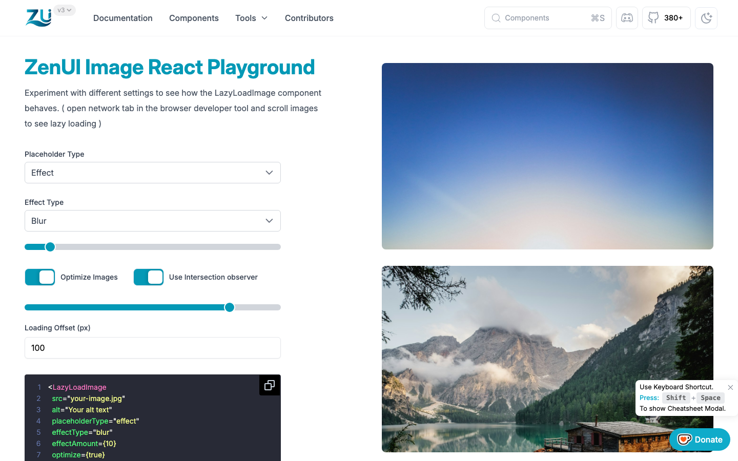
A React image component that renders responsive images with lazy loading and optimised performance, using customizable placeholders and skeletons while content loads.
Lazy loading
Intersection Observer loads images only when they enter the viewport.
Placeholders and skeletons
Blur, opacity or color effects, a custom placeholder image, or a skeleton keep the layout stable.
Responsive
srcset and sizes are generated automatically for the viewport.
On npm
npm install zenui-image-react, then use the LazyLoadImage component.
How it behaves
From input to result, in 4 moves.
Request
Image enters the viewport.
Placeholder
Skeleton holds the space.
Load
Source is fetched.
Reveal
Image replaces the skeleton.
Try it
Try the idea without leaving the page.
A small playground built with browser APIs. It shows the principle; the real tool does far more.
Under the hood
Under the hood.
- ComponentReact · npm: zenui-image-react
- BrowserIntersection Observer · srcset and sizes
Who it is for
Content sites
Long image-heavy pages that should still feel fast.
E-commerce
Product grids with stable layout while images load.
Put ZenUI Image to work.
Works alongside