







Design Systems
We build design systems the way we build ZenUI: documented, versioned and used.
Without a system, every page reinvents buttons and spacing, and the product stops looking like one product.
What clients bring us, and what we do about it.
- Problem
Buttons and spacing differ on every page.
SolutionDesign tokens and a component library shared by design and code.
- Problem
Your product runs on more than one framework.
SolutionOne design language delivered as parallel libraries, like our React and Vue editions.
Proof from products we built and run.
These are our own live products. Each one uses the same skills this service delivers.
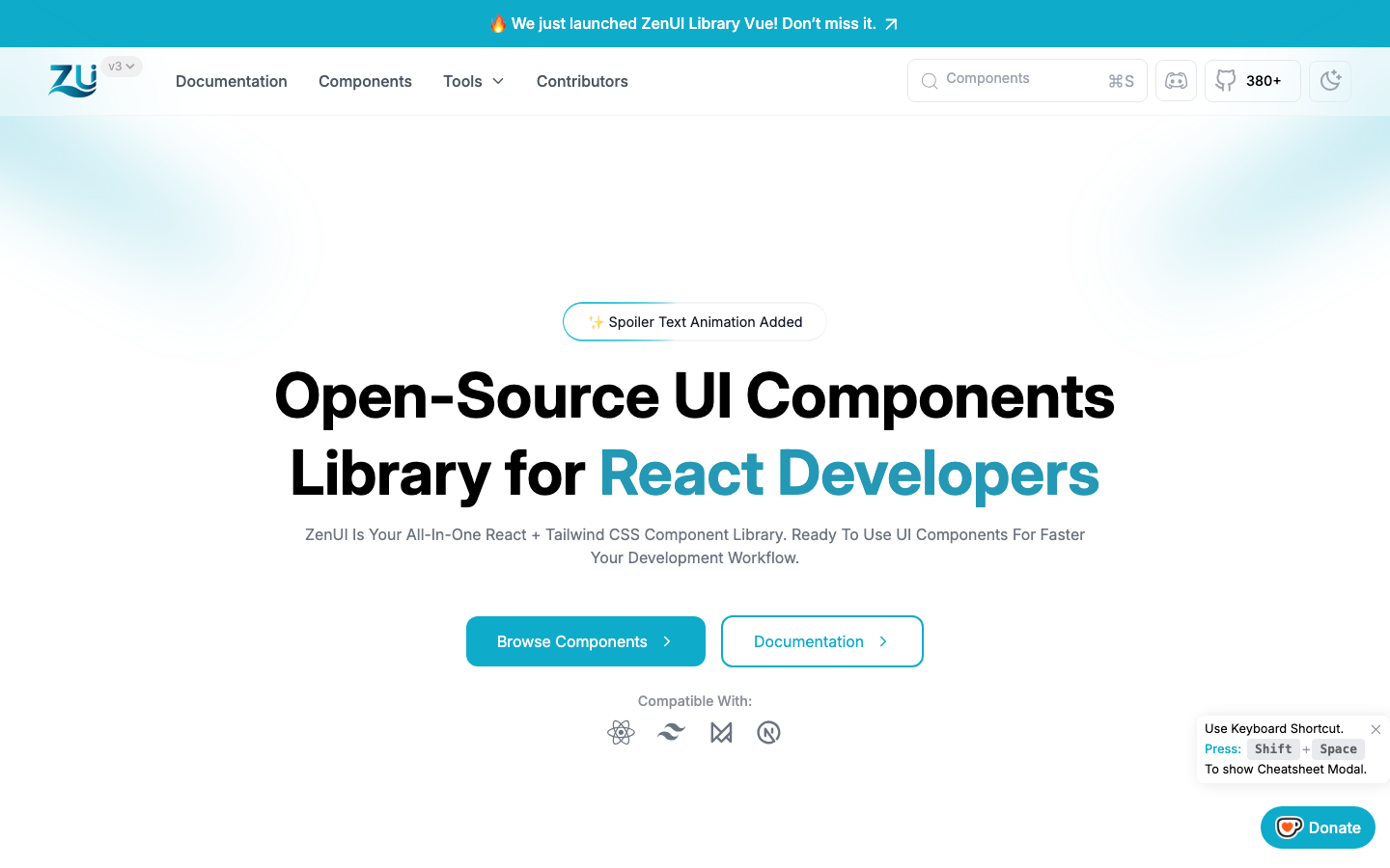
ZenUI Library for React
- Challenge
- Most projects rebuild the same buttons, forms, navigation and layouts. Heavy UI kits solve that but bring dependencies, theming lock-in and bundle weight you did not ask for.
- What we built
- A free, open-source component library for React and Tailwind CSS. Version 4 rebuilds it around reusable, typed components: 691 examples across 134 pages of components, animations and blocks, from inputs and tables to pricing sections, dashboards and animated charts. Every example is written in TypeScript, can be copied as JavaScript, and previews in light and dark at any screen width. Around 380 developers have starred it on GitHub.
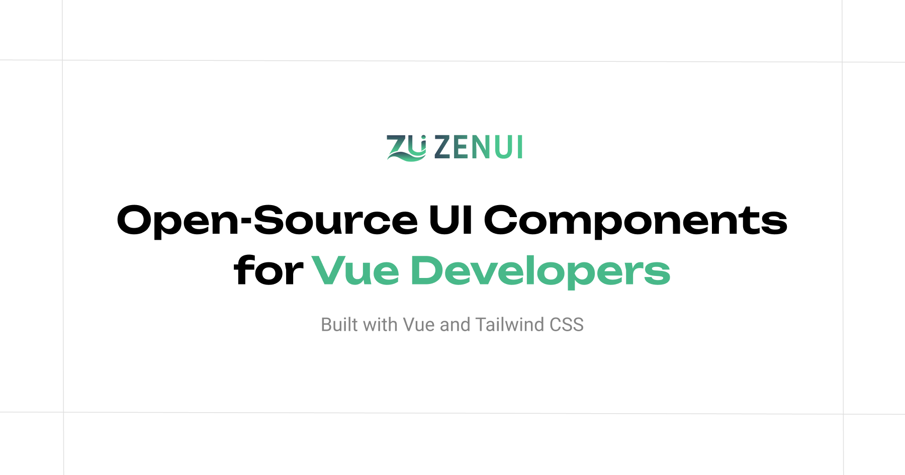
ZenUI Library for Vue
- Challenge
- Vue teams deserve the same ready-made, dependency-free building blocks as React teams, without installing a package or configuring a theme.
- What we built
- The ZenUI component library for Vue 3 and Nuxt. Version 2.0 ships 150 reusable entries (58 components, 44 blocks and 48 animations) driven by props, slots and v-model, with more than 1,600 live examples. Every snippet comes in Vue or Nuxt, TypeScript or JavaScript, with a props, events and slots table and an Edit on StackBlitz playground.
- Token set
- Component library
- Docs site
How the project runs
Discover
A short call and a written brief we both agree on.
Design
Flows and interfaces, reviewed as a clickable prototype.
Build
Typed, tested code with a live preview link from week one.
Launch
Deployment, handover docs and a support window.
Built with our own tools.
We use the open-source tools we make on client work. They are tested in public, and they save you time.
In every project, whatever the size.
- You own everythingCode, designs and documentation are yours at handover.
- Accessible by defaultContrast, keyboard paths, labels and focus states built in.
- Responsive, not squeezedMobile layouts designed as their own compositions.
- Measured performanceSpeed checked before launch, not promised after.
- A live preview linkFollow progress on a working build from week one.
- Written handoverHow it works, how to change it, and what to watch.
Questions
What clients usually ask before a design systems project. Anything else, ask us directly.
Still deciding?
Tell us what you are planning. We reply with honest options, including when a smaller scope is enough.
Ask about your projectEither, or both. Our own ZenUI library ships React and Vue editions from one design language, so we have done exactly this.
It does the opposite once in place: new screens are assembled from tested parts instead of drawn and coded from scratch.
Yes. We audit what you have first and keep whatever is worth keeping.
You do. Everything is handed over at the end of the project.
One shared channel, a written weekly update and a live preview link you can check any time.
Listed prices are starting points. We confirm a fixed quote after a short discovery call.