








ZenUI Color Picker
A design-grade, fully typed color picker with wheel, slider and box variants. On npm.
- Product
- ZenUI Color Picker
- Status
- Active
- Stack
- TypeScript, React
- Updated
- 2025-10-18
The problem
Native color inputs are inconsistent across browsers and hard to style. Many picker libraries look dated, ignore keyboard users, or cannot match your theme.
The answer
What we built instead.
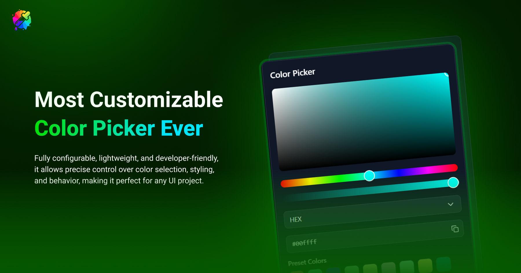
A developer-friendly color picker component published on npm as @zenuilabs/color-picker-react. It supports hex, rgb, hsl, hsv and cmyk, offers wheel, hue slider and hue box variants, and includes favorites, presets, history and light or dark themes. It is fully typed, keyboard-friendly and tree-shakeable.
Five color formats
Hex, RGB, HSL, HSV and CMYK, with a format switcher and copy-friendly output.
Three interaction variants
Wheel picker, hue slider or hue box, plus a brightness slider and fine-grained inputs.
Favorites, presets and history
Users keep the colors they reuse and can step back to earlier choices.
Accessible and themeable
Keyboard-friendly interactions, light and dark themes, and custom theme support.
How it behaves
From input to result, in 4 moves.
Install
npm install @zenuilabs/color-picker-react
Configure
Choose a variant, formats and theme.
Pick
Users choose a color.
Use
Read the value in your app.
Try it
Try the idea without leaving the page.
A small playground built with browser APIs. It shows the principle; the real tool does far more.
#D97A26
Under the hood
Under the hood.
- ComponentReact · TypeScript
- Distributionnpm: @zenuilabs/color-picker-react · Tree-shakeable build
- ConcernsCustomization · Accessibility · Theming
Who it is for
Design tools
Give users precise color control inside an editor.
Settings pages
Let customers set brand colors in a SaaS product.
Put ZenUI Color Picker to work.
Works alongside