







UI/UX Design
We design apps and dashboards by starting from what users are trying to finish.
Interfaces designed screen by screen look good alone and confuse in sequence.
What clients bring us, and what we do about it.
- Problem
Users ask support how to do basic tasks.
SolutionTask-first flows tested with a clickable prototype before build.
- Problem
Controls are inaccessible to keyboard and screen reader users.
SolutionAccessibility designed into components: focus, contrast, labels and keyboard paths.
Proof from products we built and run.
These are our own live products. Each one uses the same skills this service delivers.
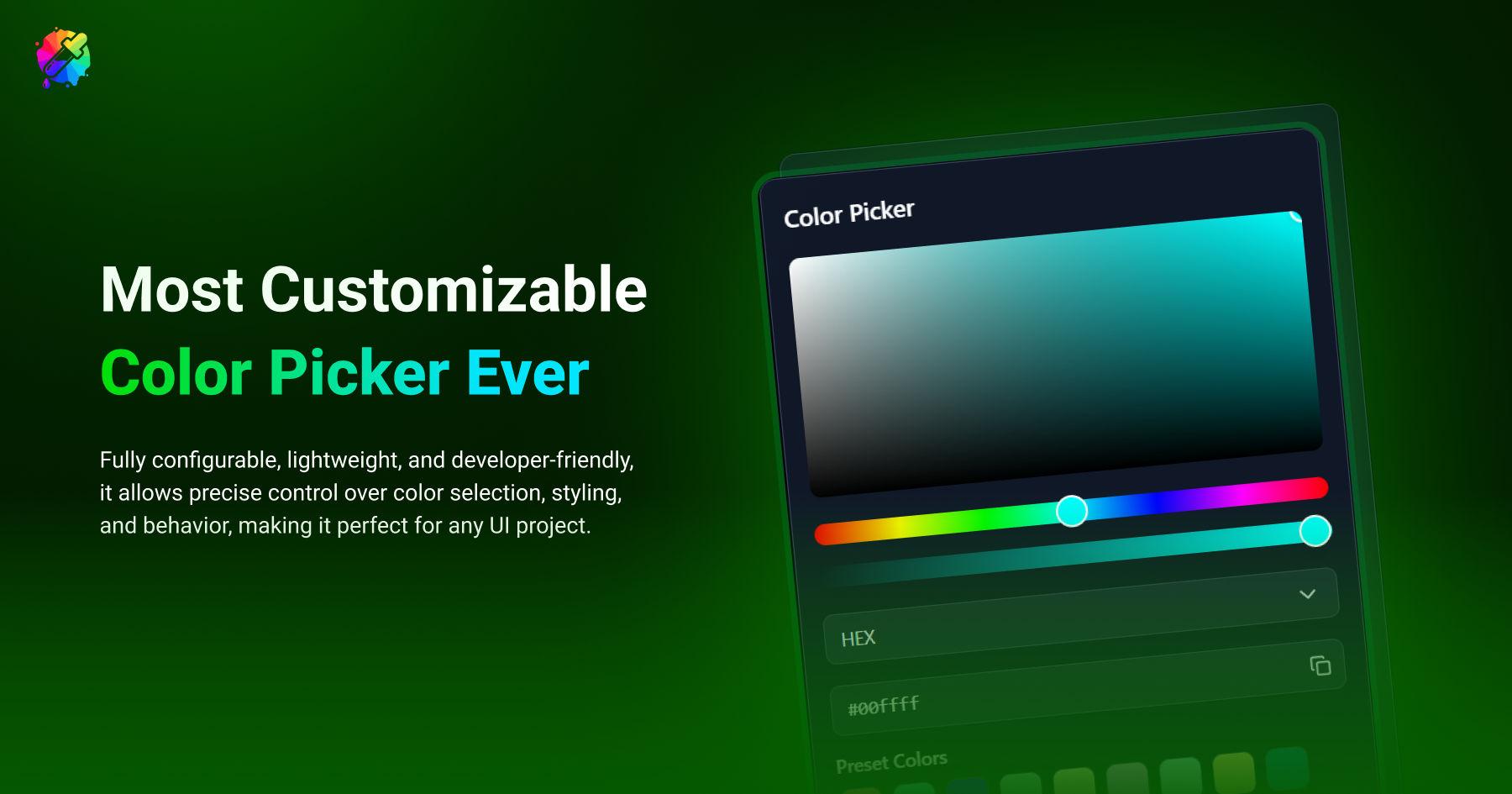
ZenUI Color Picker
- Challenge
- Native color inputs are inconsistent across browsers and hard to style. Many picker libraries look dated, ignore keyboard users, or cannot match your theme.
- What we built
- A developer-friendly color picker component published on npm as @zenuilabs/color-picker-react. It supports hex, rgb, hsl, hsv and cmyk, offers wheel, hue slider and hue box variants, and includes favorites, presets, history and light or dark themes. It is fully typed, keyboard-friendly and tree-shakeable.
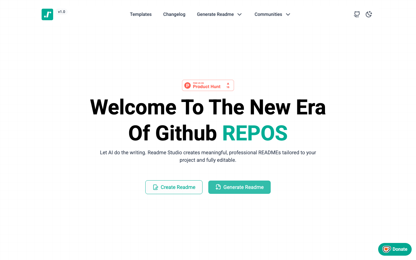
Readme Studio
- Challenge
- A README is the front door of a project, and it is usually written last and in a hurry. Missing setup steps and unclear structure cost every future contributor time.
- What we built
- Readme Studio uses AI to write meaningful, professional README files tailored to your project. Generate a draft, refine it in the built-in markdown editor with a live GitHub-style preview, or start from a pre-built template. It is open source, with more than 100 stars on GitHub.
- Flow maps
- UI designs
- Clickable prototype
- Design tokens
How the project runs
Discover
A short call and a written brief we both agree on.
Design
Flows and interfaces, reviewed as a clickable prototype.
Build
Typed, tested code with a live preview link from week one.
Launch
Deployment, handover docs and a support window.
Built with our own tools.
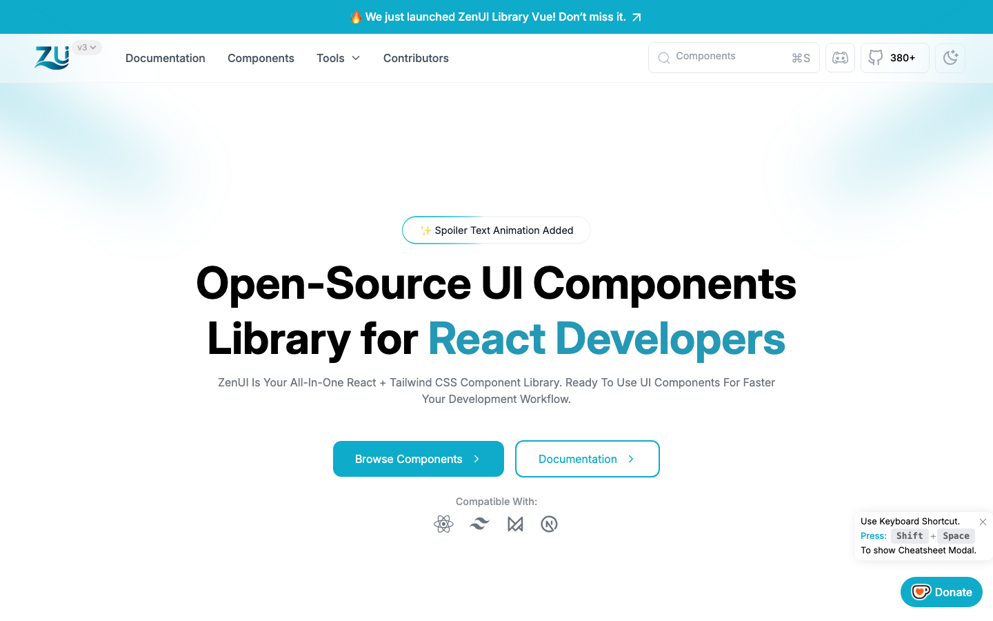
We use the open-source tools we make on client work. They are tested in public, and they save you time.
In every project, whatever the size.
- You own everythingCode, designs and documentation are yours at handover.
- Accessible by defaultContrast, keyboard paths, labels and focus states built in.
- Responsive, not squeezedMobile layouts designed as their own compositions.
- Measured performanceSpeed checked before launch, not promised after.
- A live preview linkFollow progress on a working build from week one.
- Written handoverHow it works, how to change it, and what to watch.
Questions
What clients usually ask before a ui/ux design project. Anything else, ask us directly.
Still deciding?
Tell us what you are planning. We reply with honest options, including when a smaller scope is enough.
Ask about your projectWe test key flows with a clickable prototype before build. For deeper research we plan sessions with your real users together with you.
Accessibility is designed in: contrast, focus states, keyboard paths and labels, the same standard we apply to components like the ZenUI Color Picker.
Yes. We audit what you have first and keep whatever is worth keeping.
You do. Everything is handed over at the end of the project.
One shared channel, a written weekly update and a live preview link you can check any time.
Listed prices are starting points. We confirm a fixed quote after a short discovery call.